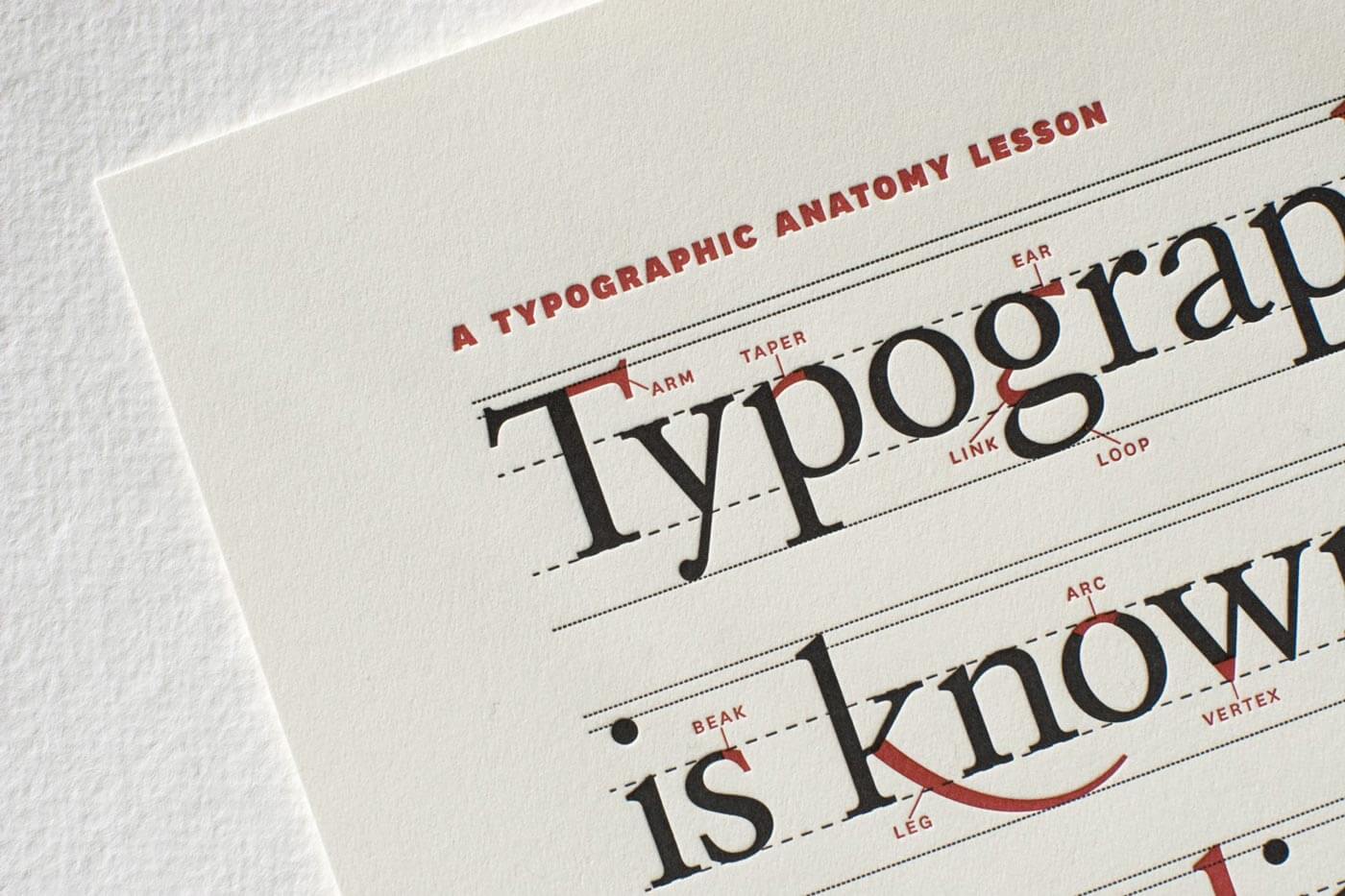
When we ask what factors influence website performance, several elements come to mind such as interface design, mobile responsiveness, SEO, code structure, and original, up-to-date content. When all of these work in harmony, we can say we are approaching an optimal level of performance. However, there is another factor that is often overlooked by many website owners, despite being critical for user experience: typography.
Your interface design may be excellent, your site fully optimised for SEO and mobile devices, and your content consistently original and up to date. But are your visitors truly able to focus on your writing? Or are technical issues within the structure of your text making it harder to read, ultimately causing users to leave your site? To address this, it is essential to understand and apply some fundamental principles of typography.

The Mathematical Dimension of Typography
It is important to note that typography is not limited to the web. Any medium that involves written text, such as books, magazines, and newspapers, relies on typography. Through typography, text is structured using various metrics including font type, font size, line height, and line width. But is there an ideal set of values for these metrics?
Although typography and mathematics are often seen as separate disciplines, they can work together to create a strong sense of balance and harmony. The way typography is structured on your website, particularly when informed by mathematical proportions, can have a significant impact on how readers perceive and process content.
Let’s take a closer look…
The Three Core Elements of Typography and Their Relationship
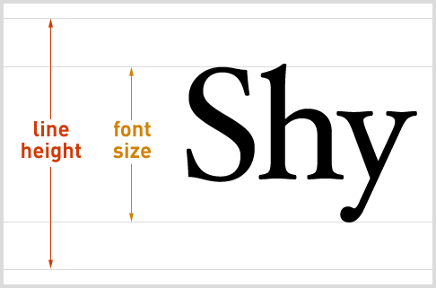
Every paragraph you see is shaped by three fundamental variables: font size, line height, and line width. Font size and line height are considered vertical measurements.
And line width represents the horizontal dimension.
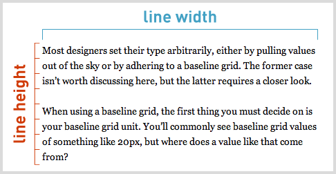
To better understand how these elements interact, let’s look at a few examples. In the example below, only the font size is changed, while line height and line width are kept constant.
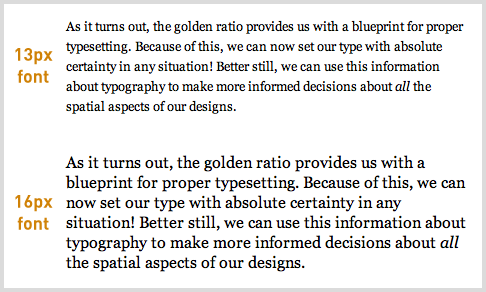
As seen in the example above, when line height and line width remain fixed, increasing the font size causes the lines to appear closer together, as in the second paragraph. This shows that font size and line height need to be proportionate.
In the next example, font size and line height are kept constant, and only the line width is changed.
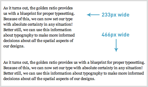
As seen in the example above, even when font size and line height remain the same, differences in line width create noticeably different reading experiences.
This can be explained simply. As line width increases, readability decreases. This is because the reader is more likely to lose their place when scanning across wider lines of text.
A study conducted in 2004 by the University of Reading led by Mary C. Dyson, supports this finding. It shows that longer lines increase the likelihood of readers skipping lines while reading.
As a result, regardless of font size, increasing line width requires a corresponding increase in line height to maintain a smooth reading experience. In other words, these elements are directly related.
After understanding the relationship between these variables, we arrive at the key question: what should the ideal mathematical relationship between them be?
Ideal Proportions and the Golden Ratio
When looking for a mathematical relationship between these measurements, there is one constant that stands out. The Golden Ratio, a proportion found throughout nature and widely used in art as a standard of balance and harmony, is often associated with the concept of perfection. It is also closely linked to the Fibonacci sequence.
This ratio (1.618…) appears in plants, animals, the universe, and even human DNA. It has been studied extensively over the years and applied across many disciplines. Naturally, it can also be applied to typography. But how?
The Mathematical Expression of Golden Ratio Typography
If we begin with the relationship between font size and line height, which are directly proportional, we can introduce a constant (h) into the equation alongside font size (f) and line height (l). This gives us a simple formula that defines their relationship.

When the ratio represented by h is replaced with the golden ratio, it yields an optimal line height based on that proportion. The final form of the formula is shown below.

However, relying solely on font size to determine an optimal line height based on the golden ratio is not sufficient. There is another variable we need to consider: line width (w). In other words, we cannot ignore line width if we want to reach a truly optimal result using the golden ratio.
The challenge is that the exact relationship between line height and line width is not clearly defined. What we do know is that line width should be significantly greater than line height.
With this in mind, we can model the relationship between optimal line height and line width as an exponential one and construct a formula accordingly.

Once we establish a formula like above, we can express the relationship between font size, line height, and line width within a single framework.
There is, however, another practical issue. Web browsers do not always handle the level of mathematical precision required by these formulas.
Most designers use whole numbers for values such as font size, line height, and line width. The results produced by these formulas are often decimal values, and applying them directly in a web environment can lead to inconsistencies or rendering issues. So what can we do?
Applying the Golden Ratio to Web Typography
To better understand how this works in practice, let’s look at a simple example.
For a font size of 16px, if we take the golden ratio as our constant, the optimal line height comes out to approximately 25.88854px. Using this value, the corresponding line width is calculated to be around 670.21670px.


In practice, however, we cannot reliably use such precise decimal values in CSS. A more realistic approach would be to round the line height to 26px. But doing so means moving slightly away from the mathematically optimal value.
Rounding the line height to 26px also implies that the line width should be slightly larger than 670.21670px.
If the line width is smaller than the optimal value, then the line height should also fall below the golden ratio. The inverse is also true. These variables must remain balanced relative to each other.
The chart below, based on commonly used font sizes, illustrates which line widths and line heights best align with the golden ratio.
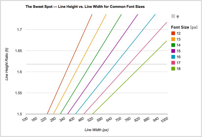
Taking all of this into account, when configuring typography under different constraints, we need to solve for two unknowns:
- With a fixed font size and line width, determine the optimal line height.
- With a fixed font size and line height, determine the optimal line width.
The mathematical expressions for these are as follows.
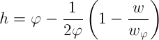

Using the second formula above as an example, if we set the font size to 16px and the line height to 26px, we arrive at a line width of approximately 685.32505px. For practical use on the web, this would be rounded to 685px.
In another example, if we set the font size to 16px and the line width to 550px, we get the following result:

In this case, when adapting the line height for use on the web, the calculated value of 25.00169px needs to be rounded to 25px.
Golden Ratio Typography Calculator
If you prefer not to work through these calculations manually, you can use a dedicated tool designed for this purpose. The “Golden Ratio Typography Calculator” developed by Chris Pearson, allows you to determine ideal typography values without dealing with complex formulas.
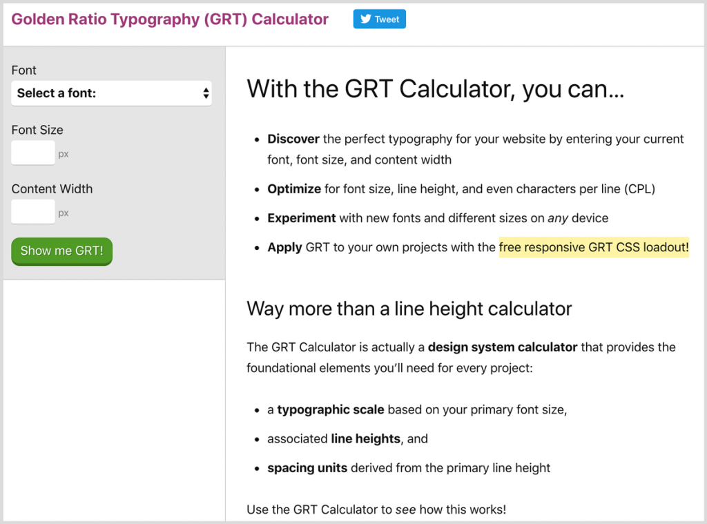
By entering your font size or layout dimensions, the tool provides optimal combinations for font size, line height, and line width based on the golden ratio.
If you enter only the font size, it returns the optimal line height and line width. If you enter only the width, it suggests the best size combinations.
If you enter both font size and line width, it presents four different optimisation options:
- Typography optimised for font size and line height
- Best typography based on line height
- Second-best option based on line height
- Typography optimised for font size
You can access the calculator by clicking here, and apply the most suitable typography values you find to your own projects.
Sources: University of Reading (Mary Dyson), GRT Calculator, Pearsonified (Chris Pearson)