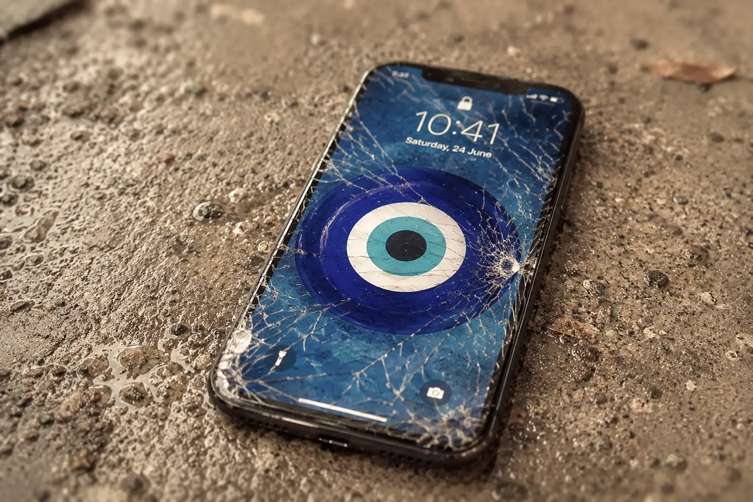
You bought a new phone. Out of the box, screen protector on, case fitted. For two weeks you carried it like a newborn and defended it against every hazard the world could think of. Then one day it slipped out of your hand as you pulled it from your pocket, and it hit the floor. Your stomach dropped (and you probably swore, at length, in ways I won’t reproduce here). You picked it up and turned it over, checking every edge. And there it was. A scratch on the corner.
Then came the line you would expect from the friend standing next to you. “Nazar çıktı.”
If you didn’t grow up in Türkiye, that sentence needs unpacking. “Nazar” is the evil eye. The belief is that envious or admiring looks settle on a person or an object and bring it harm. New things attract it, beautiful things attract it, and expensive things attract it most of all. When the first damage arrives, the scratch or the chip or the dent, that accumulated ill will is understood to have discharged itself. The object has paid its toll. “Nazar çıktı” means, roughly, the evil eye has come out. It’s over. You can relax now.
And you do relax. After that sentence you notice you’re carrying the phone quite happily. You put it down on tables without thinking. You drop it into a pocket or a bag without hesitating. The object has been released from that invisible contract flawlessness imposes, and it has finally, properly, become yours.
The largest companies in the world spend billions to stop that scratch from ever happening. But this isn’t just about phones, of course. It’s in checkout flows, in signup forms, in search results, in app interfaces, in algorithms. Frictionlessness has become the shared religion of an entire industry and it now turns up everywhere. Seamless. Frictionless. One-click. Zero friction. Silicon Valley’s favourite word of the past twenty years describes the absence of something.
This piece isn’t a defence against that idea. It’s an attempt to answer a simpler question. If friction is so terrible, why do people keep drifting towards it?
So what is friction, exactly?
In the behavioural science literature, friction is the total effort required to complete an action. One more step, one more form field, one more wait, one more decision point. The equation is simple: Increase friction and the odds of that behaviour fall. Reduce it and they rise.
Richard Thaler and Cass Sunstein popularised this mechanic with Nudge. Thaler then gave the other side of the coin a name of its own: Sludge. The system that lets you subscribe in a single click but requires a phone call during office hours to cancel. The seven-page form standing between you and your tax refund. The gym membership you can only end by turning up in person. Sludge is friction turned against you. It is deliberate difficulty, the ill-intentioned twin of the nudge. As Thaler put it at Chicago Booth, the newspaper that signs you up in one click and cancels you over the telephone is doing exactly this.
So far, so familiar. The interesting part shows up in a meta-analysis published in Royal Society Open Science in 2023. Yu Luo, Andrew Li, Dilip Soman and Jiaying Zhao pulled 184 field experiments conducted between 2008 and 2021, covering more than 2.2 million participants, into a single framework. Two findings stand out:
- Interventions that change effort outperform interventions that change motivation. In other words, adding or removing a step works better than trying to persuade anyone of anything.
- Nudge and sludge have comparable effect sizes. Adding friction and removing it are tools of roughly equal power.
The researchers also define a category called beneficial sludge. These are interventions that make an action harder, but do so for the person’s own good. The “are you sure you want to complete this purchase?” prompt is the obvious example. So whether friction is good or bad is not a question of adding or removing. It is a question of whose interest it serves.
Which lets us draw the distinction that the rest of this piece rests on:
- Good friction: A snag that helps users reach their own goal. It increases value, reduces error and creates a sense of ownership.
- Bad friction (sludge): A snag that pulls users away from their own goal and works only for the company or the institution.
Lippincott’s Friction as a Catalyst for Growth translates the same idea into marketing language with a nice image: An egg cracked into a brand new non-stick pan slides around without catching on anything. That’s precisely what the industry expects from customer experience. The author’s view is that this expectation is far too idealistic, because human experience is not Teflon. The piece goes on to describe friction as “a force that produces energy”. Physicists would object to that sentence, since friction doesn’t produce energy, it converts motion into heat. But the metaphor points somewhere true: Friction is evidence that something is happening. An advert that stops somebody’s thumb halfway through an infinite scroll is, by definition, a friction. Capturing attention means interrupting a flow. Which is why frictionless marketing cannot exist; if it did, nobody would notice anybody.
What the science says: Labour, love and memory
We’ve been running on intuition so far. Let’s go into the laboratory for a bit, because “friction is sometimes good” is not just a pleasing paradox. There’s half a century of literature behind it, and that literature answers three separate questions. Why do we value the things we work for? What changes when we can see a service or a company making an effort on our behalf? And does struggling actually help us learn? Let’s take them in order.
The IKEA effect
In 2012, Michael Norton, Daniel Mochon and Dan Ariely published what has since become a classic in the Journal of Consumer Psychology. They had participants assemble IKEA storage boxes, fold origami and build Lego sets. Then they measured how much those participants valued what they had made.

It turned out that people rated their own amateur efforts as nearly equal in value to work produced by experts. They also assumed everybody else would see it the same way.
The genuinely valuable part of the study, though, is the boundary condition it identifies, the point at which the effect breaks down. Labour only turns into love when the work is finished. When participants had to dismantle what they had built, or were prevented from completing it, the effect vanished entirely. So there’s no rule saying “make it harder and value goes up”. The rule is make it harder, but let them finish.
This distinction is worth holding on to, because the first thing anybody in the industry does upon discovering friction is bolt a few more screens onto the onboarding flow. Which isn’t what the study says at all. Keeping somebody busy across five screens doesn’t let them complete anything, it just wears them out. You land squarely in the place where the effect disappears.
“Just add an egg”
In the 1950s, General Mills launched instant cake mixes under the Betty Crocker brand. Everything was in the box. Flour, sugar, powdered milk, powdered egg. All you had to do was add water and put it in the oven. Looking back at the period, the idea sounds excellent, and yet sales came in far below expectations.
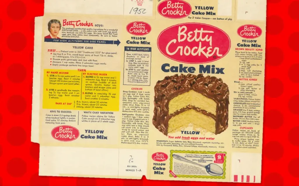
Enter Ernest Dichter, the Vienna-born psychologist and market researcher, with his diagnosis. Housewives felt guilty using a product that made cake this easy. Cake was meant to be special, it was meant to take effort, and what came out of that box made no effort visible. The solution was as elegant as the diagnosis. Take the powdered egg out of the mix and let people crack a fresh one themselves. Then advertise it as “just add an egg”.
This story is a staple of marketing presentations. I should add a note here, though, because the version told on stage has clearly been through a few rounds of polishing. Some sources point out that the fresh egg idea was already around years before Dichter, and that the sales recovery can’t be pinned on a single psychological touch. So the story is not “entirely true”, but it is not “entirely false” either.
Dichter had no proof, but his diagnosis held up. In 2014, Simone Dohle and her colleagues gave participants the same raspberry milkshake in two ways. One group received it ready-made, the other measured and mixed the ingredients themselves. Same recipe, same ingredients. The people who mixed it themselves liked it more and drank more of it. The egg was never really being added to the cake. It was being added to the person.
The labour illusion
Ryan Buell and Michael Norton’s study The Labor Illusion, published in Management Science in 2011, turns classic operations theory on its head. That theory says, roughly, “the longer people wait the less satisfied they are”. Buell and Norton showed this isn’t always true.
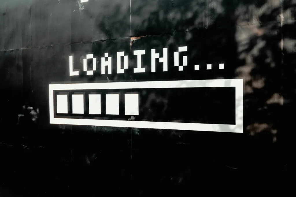
Participants were kept waiting on a simulated flight search site for anywhere between 0 and 60 seconds. One group saw an empty loading bar. The other saw a continuously scrolling list showing which airline sites were being searched at that moment. The results were identical. But the people who saw the scrolling list rated the service as more valuable. In some conditions they preferred it to the version that returned results instantly.
This is called the labour illusion. When a system shows you it’s working, reciprocity kicks in and perceived value goes up. You now know why pizza chains have order trackers. And why Dyson keeps mentioning those 5,127 prototypes in its advertising.
Park this one for now, because we’ll come back to it later. The effect discovered for a flight search site in 2011 has resurfaced in the interface design of AI language models from 2025 onwards.
Hard to read, easy to remember
In 2011, Connor Diemand-Yauman, Daniel Oppenheimer and Erikka Vaughan published a paper in Cognition with a rather good title. Fortune Favors the Bold (and the Italicized). The finding was that information presented in hard-to-read fonts was remembered better than information in easy-to-read fonts. Both in the lab and in actual secondary school classrooms.
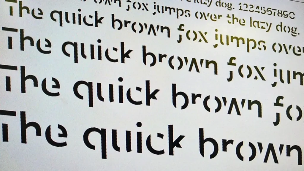
The explanation rests on Robert Bjork’s concept of desirable difficulties. When the brain struggles to process something, it comes off autopilot and switches into analytical mode. To borrow Kahneman’s language, as I did in my piece Can Irrational Human Behaviour Be Explained by Quantum Physics?, it is a promotion from System 1 to System 2.
See also: Today’s Menu: Blue Pill or Red Pill?
It should be said that this finding hasn’t held up consistently. Claims that Sans Forgetica, a font developed at RMIT in Australia on precisely this principle, improves memory were not supported by subsequent studies. The literature is genuinely mixed. Some studies found a benefit, some found no effect at all, and some found it made things worse.
Which means “friction is good” can harden into dogma just as easily as “friction is bad” did. It would be more accurate to say that some frictions work, in some conditions, for some people.
Friction sometimes saves lives
Laboratory experiments are lovely. They’re controlled and they’re clean. But the sample sizes are small and nobody’s life depends on the origami they just folded. Let’s look at some examples that millions of people have actually lived through.
Remove the traffic signs, watch the accidents fall
The story of the Dutch traffic engineer Hans Monderman is perhaps the most radical example in this piece. In 1982, in the village of Oudehaske, budget constraints meant Monderman couldn’t install conventional traffic calming measures, so he tried the opposite. He removed the signs, the road markings and the kerb separating pavement from carriageway.
Vehicle speeds dropped by 40%.

His most famous application came in 2001, at the Laweiplein junction in Drachten. Traffic lights, pedestrian crossings and warning signs were stripped out of a junction carrying 22,000 vehicles a day and replaced with a shared space where nobody had clear priority. Traffic flow improved, accidents fell, and speeds dropped below what a speed gun could usefully measure.
Monderman’s logic was straightforward: Giving a driver a “green light” is a way of telling them “you don’t need to think” (no friction, System 1). Introduce uncertainty and the driver has to actually look at the pedestrian (friction, System 2). Reading a sign is cognitively easy. Looking a human being in the eye is hard. And the hard thing is the safe thing.
In short, when you remove every uncertainty you remove attention along with it.
Want to read this before you share it?
In June 2020, Twitter began an experiment with Android users. If you tried to retweet an article without opening it, a small prompt appeared on screen: Headlines don’t tell the full story. Want to read this before sharing?
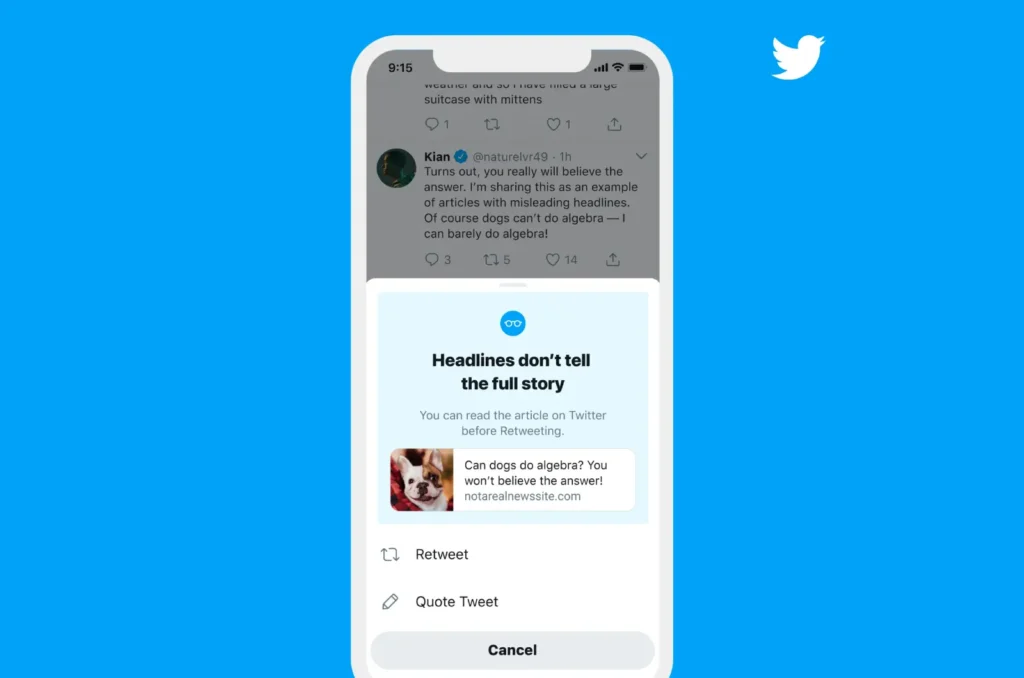
In September 2020 they published the results. People opened articles 40% more often after seeing the prompt. Some of them, having read the article, decided not to retweet it at all.
Total cost: One screen, two buttons, roughly a second and a half. Total gain: Slightly fewer people sharing things they haven’t read. This is the textbook case of good friction. It doesn’t block the user, it just lifts them off autopilot, out of System 1, for a moment.
And the places where friction was quietly removed
Now the other side of the coin. Infinite scroll, associated with Aza Raskin, removed the smallest obstacle standing in front of a behaviour. The end of the page. You used to have to press “next” (or click through pagination) when you reached the bottom. That press was a tiny moment of decision. There’s no such moment now. There’s nothing left to remind you to stop.
NOTE: Raskin later had a change of heart and has said he regrets an invention that steals attention and builds dependency.
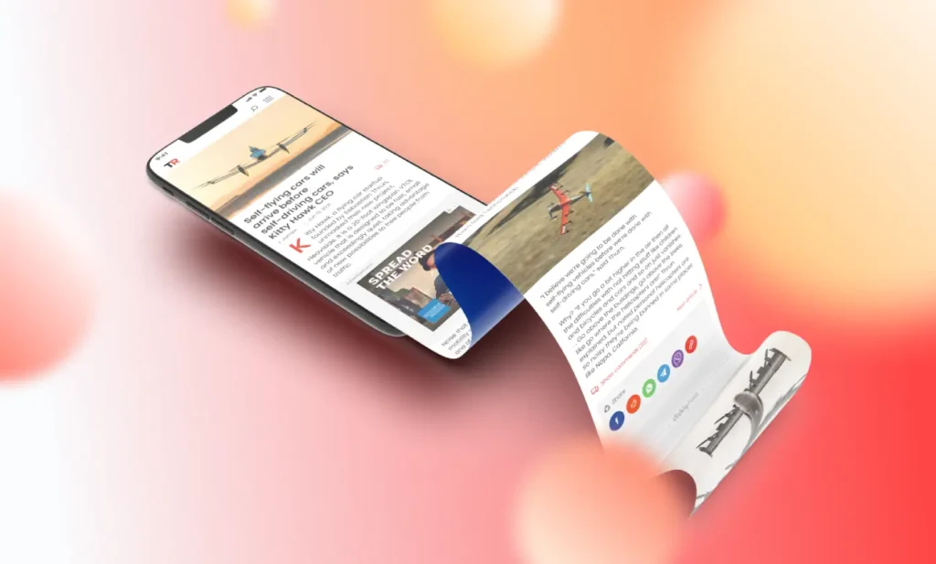
Amazon’s 1-Click patent follows the same logic, erasing the entire distance between the decision to buy and the payment. Which is to say, erasing the time available to think twice.
See also: You Have a Notification! – The Attention Industry and Our Habits
Set against that, there’s a great deal of good friction sitting quietly in our lives that nobody complains about.
- Two-factor authentication. Everybody grumbles, nobody switches it off.
- Gmail’s undo send. A five second delay that has rescued more careers than anyone can count.
- Blister packaging for medicines. Not loose in a bottle, but pushed out one at a time. This is a design choice that makes a measurable difference in overdose cases.
- Cooling-off periods. The statutory right to change your mind on insurance, credit and distance selling contracts.
- “This action cannot be undone. Are you sure you want to continue?”
All of these slow you down. None of them stop you. That’s where the difference lies.
Nazar çıktı: The social technology of imperfection
Let’s go back to the phone at the top of this piece.
The Turkish phrase said when something newly bought takes its first damage, nazar çıktı, looks at first glance like the residue of a superstition. The assumption is that the envious gaze, the jealousy, the ill will, has struck the object and dispersed. Is it scientific? No. Is it nonsense? Also no.
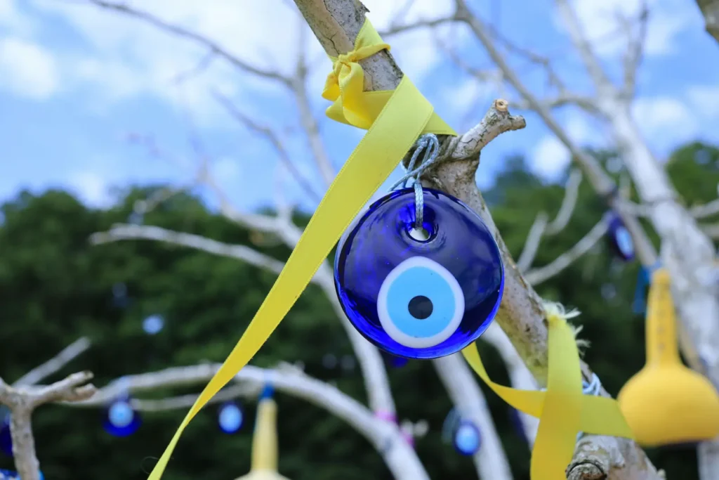
Let’s translate the effect of that sentence into psychological terms.
- It reframes the pain of loss. What you lost, flawlessness, turns out to have been a price, and you have now paid it. The damage stops being damage and becomes a kind of payment.
- It anchors a vague anxiety to a concrete event. The brain dislikes what it can’t explain. Nazar offers an explanation, and the story closes.
- Most importantly, it makes the object usable. A flawless object is an obligation. You’re required to protect it. A scratched object is simply yours.
The third point is what this whole piece is about. Flawlessness is a contract, and it is an unsustainable one, because the only direction perfection can travel is downwards. The moment something becomes perfect, your relationship with it shifts from “improving” to “protecting”. And protecting is exhausting work.
The interesting thing is that humanity has been using the same trick to solve this problem for thousands of years. Add the flaw yourself.
The tradition of the deliberate flaw
- The Persian flaw: Carpet weavers in Kashan, Isfahan, Tabriz and Mashhad would deliberately tie a single knot wrong in every rug they wove, on the grounds that only God is perfect.
- The Navajo spirit line (ch’ihónít’i): Navajo weavers work a single line of contrasting colour that runs from the centre of the rug out to its edge. One reason given is to open a path for the part of the weaver’s own spirit that becomes entwined in the cloth as she works, letting it leave safely. The other is humility. In the work of the anthropologist Jill Ahlberg Yohe, this “deliberate error” is described as an expression of modesty.

- Islamic art and architecture: Ceiling decoration that looks flawless will often contain small irregularities that most visitors will never spot. Same reasoning. Perfection belongs to the Creator alone. (The story that Mimar Sinan, the great Ottoman architect, built deliberate flaws into his buildings is the Anatolian version of this tradition, though how much of it is documented history and how much is folklore is a separate argument).
- Kintsugi, the Japanese art of golden repair: Broken ceramics aren’t thrown away. The cracks are filled with lacquer mixed with gold dust. The break is not concealed, it is emphasised. The story goes that it began in the fifteenth century when the shogun Ashikaga Yoshimasa was displeased at having his broken tea bowl returned to him held together with ugly metal staples. The philosophy behind it, wabi-sabi, locates beauty in imperfection, impermanence and incompleteness.
Different continents, different religions, different centuries. They’re all saying the same thing. Flawlessness is not a target, it is an illusion, and carrying that illusion around is exhausting. So put the flaw in yourself and keep control of it.
Nazar çıktı is the modern, everyday version of this. The only difference is that we don’t put the flaw there, life does. We just give it a name.
Symmetry, asymmetry and aesthetic friction
Let’s move on to aesthetics, because a similar story plays out there.
The belief that symmetrical faces are “beautiful” is widely held. Evolutionary biology explains it as a signal of genetic robustness, and Gillian Rhodes and colleagues’ 1998 study provides strong evidence in that direction. When facial symmetry was increased, attractiveness ratings went up.
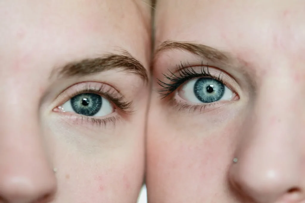
Other work in the same field says the opposite. In John Swaddle and Innes Cuthill’s 1995 study, faces made more symmetrical were rated as less attractive. The researchers’ interpretation was this: Some facial asymmetries are not random. They are directional and they carry expression. Erase them and the face starts to look emotionless.
The difference, it later emerged, comes largely down to method. “Chimeric” faces, made by mirroring one half of a face, are perfectly symmetrical but abnormal. Nose width, eye spacing and mouth size all drift away from anything natural. Which is why chimeric faces are rated as less attractive than the originals. In faces produced by blending the left and right mirrorings together, symmetry really does increase attractiveness.
So the issue is not symmetry, it is normality. Our brains reward familiarity rather than symmetry. And nothing familiar is ever perfectly symmetrical.
The everyday examples are more or less endless, but here are a few.
- Cindy Crawford’s and Marilyn Monroe’s moles. Flaws that agents suggested correcting early in their careers, and which then became the brand itself.
- Fashion hunting down gapped teeth (diastema), freckles and unusual noses. The industry sells flawless beauty, but agencies look for a memorable face. These are not the same thing.
- Vinyl crackle. Technically a degradation of the signal. People pay money for it.
- Film grain added back into digital photographs. We shoot on a flawless sensor and then use software to add noise that imitates the flaws of film.
- Synthetic engine noise piped into electric cars. Silence was a genuine engineering achievement, and drivers found it lacking.
- The shutter sound on phones. There’s no physical shutter. The sound is entirely invented. And without it we don’t quite believe the photograph was taken.
The pattern is the same in every case. Engineering removes a snag and then marketing puts it back.
This is also why handmade goods sell for more than manufactured ones. The slight lean of a ceramic bowl is not a defect, it is a form of identification. It proves that a hand was involved, and that the hand belonged to somebody. A manufactured product can’t prove that, because flawlessness has no identity.
AI: The uncanny valley of smoothness
Right, now to the main point.
Have a look around you. You’ll see that people have split into two camps over AI, with almost nobody in between. One side puts it to work on everything, places it at the centre of daily life, and even consults it on emotional decisions. The other side doesn’t just refuse to use it, they’re actively disturbed that it exists. They’re angry. Saying that a piece of writing “reeks of AI” has become an unforgivable insult these days.
Explaining that split takes a few concepts stacked on top of one another.
The black box problem: We don’t trust what we can’t understand
Paul Jones of Aston University, writing in The Conversation under the title Why do some of us love AI, while others hate it?, argues that the question has less to do with how AI works than with how we work.
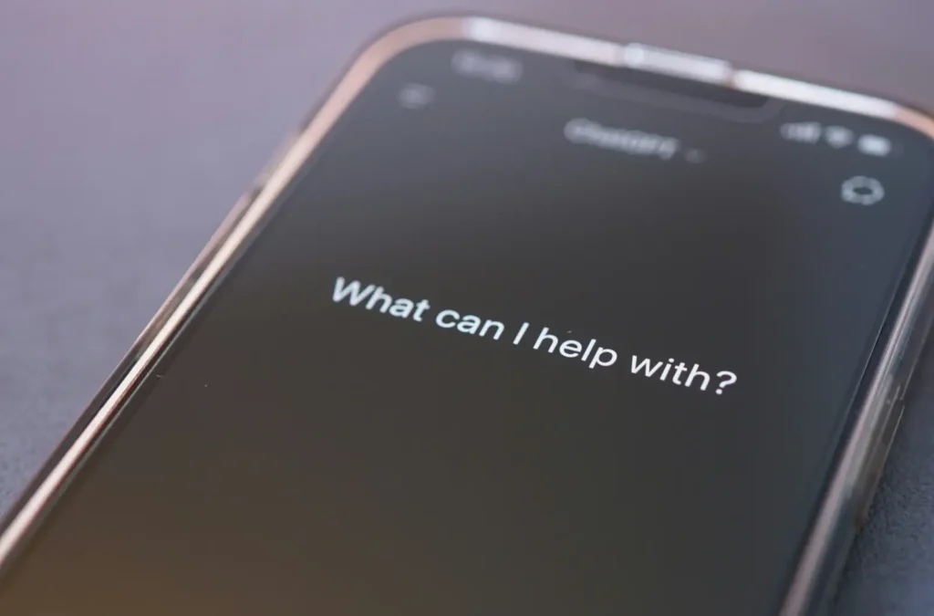
People trust systems they understand. Turn the key and the car starts. Press the button and the lift arrives. Cause and effect are visible, and they can be interrogated. Most AI systems are black boxes. You type something and an answer appears. The reasoning in between is invisible. That’s psychologically uncomfortable, because you can’t object to a decision-making process you can’t see.
This is where the brain’s aversion to uncertainty and to whatever it can’t make sense of comes in. Even when a system we don’t understand gives us the right answer, we’re not entirely reassured.
Algorithm aversion: The same mistake, two different verdicts
Which brings us to Algorithm Aversion, published by Berkeley Dietvorst, Joseph Simmons and Cade Massey in the Journal of Experimental Psychology: General in 2015. The findings are clear and a little uncomfortable.
When people see an algorithm make a mistake, they lose confidence in it far faster than they lose confidence in a human who makes the same mistake. What’s more, they go on preferring the human even in cases where they have watched the algorithm outperform them.
So the problem is not performance. The problem is expectation. We expect flawlessness from machines. We don’t expect it from people.
The same team’s follow-up work, published in Management Science in 2018, points to the fix: When people are allowed to adjust an algorithm’s output even slightly, they will accept using an imperfect one. Not full control. Just a little room to intervene.
What’s happening here is the IKEA effect we discussed earlier. Once a user has laid a hand on an output, that output becomes theirs. And people are considerably more forgiving of what belongs to them.
The professor who spilled his coffee: The pratfall effect
In 1966, Elliot Aronson, Ben Willerman and Joanne Floyd published an experiment in Psychonomic Science that runs to two pages in total and has been discussed for half a century.
Participants listened to an audio recording of somebody rehearsing for a quiz show. The person on the tape was either extremely competent (answering 92% of questions correctly) or mediocre (30%). At the end of some recordings, the speaker spilled coffee down himself and apologised. In others, that section was absent.
The competent person was liked more when he spilled his coffee. The mediocre person making the same mistake was liked even less.
Aronson’s explanation was this: Somebody who appears flawless reads as superhuman and therefore as distant. A small piece of clumsiness humanises them and closes the gap. But for a mediocre person, the same mistake is simply evidence of mediocrity.
“Humanlike” robots
In 2017, Nicole Mirnig and her team at the University of Salzburg repeated the experiment with robots. In To Err Is Robot, published in Frontiers in Robotics and AI, some participants interacted with a social robot that worked flawlessly and others with the same robot deliberately programmed to make mistakes.
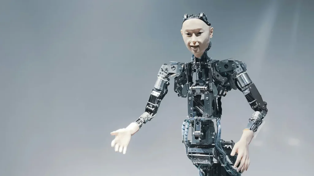
They liked the faulty robot significantly more than the flawless one. They didn’t rate it as less intelligent or less humanlike either. They just found it more likeable.
The researchers recommend designing robots with their likely flaws in mind, on the grounds that an interaction that embraces imperfection makes for a more natural and more convincing relationship.
Putting it all together
Now let’s revisit the love-hate divide. The real finding in Aronson’s experiment was not that mistakes make everybody more likeable. The effect of the mistake depended on how you already saw the other party.
The same holds for AI.
- For the user who sees it as competent, an error is a humanising moment. When a model says it doesn’t know something, or corrects itself, the user moves a little closer. The coffee has been spilled and the distance has closed.
- For the user who was already sceptical, the same error is simply a confirmation. I told you so. Like the mediocre man spilling his coffee.
One mistake, two opposite outcomes in two users. The people who love it and the people who loathe it are observing the same event from different starting points.
There’s another layer on top of this, and I think it’s the important one. The text you get back from an AI model is too smooth. The grammar is flawless. There’s no hesitation. You rarely see an “um”, a “sort of”, or a “hmm, I’m not certain about this”. The answer arrives instantly, in tidy paragraphs, with the air of a well-structured essay and a suitable closing line.
Whereas ordinary human speech is full of snags, and those snags carry information. A doctor saying “this one is a bit complicated, let’s think it through” or an engineer saying “I’m not sure from here, I’d need to check” isn’t just giving you an answer. They’re telling you how much to trust that answer. This is called calibration and it’s one of the most valuable features of human communication.
Fluency erases that calibration. The model says what it knows and what it does not know in exactly the same confident register. And there’s no facial expression in front of you, no tone of voice, no pause. Jones makes this point directly in his piece: Human trust does not run on logic alone. We read tone, expression, hesitation and eye contact. AI has none of these. It can be fluent, it can even be appealing, but it does not give you what a person gives you.
There’s an identity threat dimension to this too. Teachers, writers, lawyers and designers have found themselves facing tools that imitate part of their work. This is not simply a question of automation, it is a question about the value of a skill and the meaning of being human. Some of the hostility comes from there, and that’s an entirely rational response.
The ironic fix: Adding friction to AI
This is the most entertaining part. After years spent speeding everything up and stripping out every last friction, the industry is now deliberately adding slowness and visibility back into AI interfaces:
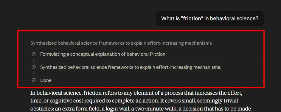
- Showing the reasoning steps: The model doesn’t print the answer straight away, it first shows its working, telling you what it’s researching and what it’s checking. This is a direct application of the labour illusion Buell and Norton described in 2011. There’s no structural difference between a flight search site saying “currently searching 47 airlines” and a model saying “let me check the sources first”.
- Streaming the text word by word: The answer is ready, but it arrives at typewriter speed. It stopped being a technical necessity a long time ago. It’s now a design choice.
- Citing sources: Prising the black box open a little.
- Expressions of uncertainty: Instructing the model to say when it’s not sure.
So the route to making AI likeable doesn’t run through making it faster. It runs through making it slower and more visible. Not flawlessness, but traceability.
While we’re here, let’s not forget the other side of the coin. Automation bias, the tendency to accept a system’s output without question, is at least as dangerous as algorithm aversion. On one side sit the people who trust it not at all, and on the other the people who trust it far too much. The healthy position is somewhere in between, standing still long enough to keep asking questions. Which takes a bit of friction.
And let’s close this section with a paradox. We complain that AI should be more like a human. Then when it behaves like one and misremembers something, we say it’s hallucinating. Humans call that misremembering, and they do it every day. Perhaps the real issue is not that AI makes mistakes, but that it can’t express having made one the way we do.
So what does a marketer do with all this?
NOTE: If you don’t work in marketing, this section may bore you. Feel free to skip it.
If you’ve read this far, we can move on to the practical part. “Friction is good” is a dangerous sentence in the wrong hands, and it can be used to justify any friction at all.
Here’s a three-question test that holds up in the real world.
1. Whose interest does this friction serve? If it serves the user’s goal, it’s good friction. If it only serves the company’s metrics, it’s sludge. Two-factor authentication is good friction. Making people ring up to cancel is sludge. The difference is not moral, it is structural.
2. Will the user thank me for it afterwards? An “are you sure?” screen earns thanks the day it stops somebody sending £500 to the wrong account. Nobody has ever thanked anyone for a three-page form standing in front of a newsletter signup.
3. What would I lose if I removed it? If removing a step lifts conversion but also lifts your return rate, cancellation rate or support tickets, that step was actually a filter. Some of the friction at the top of the funnel determines the quality further down.
Where this applies in practice:
- Meaningful questions during onboarding. Asking a user what they’re here to achieve is a friction, but it improves both personalisation and buy-in. Pointless mandatory fields are just sludge.
- Invites and waiting lists. Gmail’s 2004 invite system is the classic case. Making access harder made access valuable. A word of caution, though. This trick only works if there is a genuinely good product behind it. You can’t rescue a bad product with a waiting list, you can only postpone the inevitable disappointment.
- Cost as signal. Michael Spence’s signalling theory holds that expensive and hard-to-imitate behaviours carry credible information. Phillip Nelson applied this to advertising. Producing a big-budget campaign for a bad product is not impossible, it is simply unprofitable, because there will be no repeat purchase to earn the money back. Which is why a large production tells you something about a brand’s confidence in its own product even when it tells you nothing about the product.
- Operational transparency. Pull the curtain back. Show how you make it, how much work goes into it, what the process looks like. The most honest version of the labour illusion is the version that is not an illusion. If the work is real, show it.
- Asymmetric friction. Make returns and cancellations easy, then add a second’s worth of thinking time to the purchase. It’s the exact opposite of what the industry does, and that is precisely why it stands out.
And the distinction Lippincott reminds us of is worth holding on to. In marketing, effectiveness is about creating good friction, the thing that stops the scroll, catches attention and stays in the memory. Efficiency is about finding and clearing out bad friction, the disconnect between sales and marketing, the unqualified leads, the places where the funnel jams. The two shouldn’t be confused.
Conclusion
In physics, friction looks like the enemy of motion. And yet you can’t walk without it. Your shoe wouldn’t grip, the wheel wouldn’t roll, the brake wouldn’t bite, the knot would come undone. Friction is control itself.
The same goes for human experience. Every step you remove buys you speed, and costs you something. The moment of decision. And an action with no moment of decision in it is not really your action at all.
Let’s return one last time to the phone at the top of this piece. What you lost when that scratch appeared was the value of the object. What you gained was your relationship with it. The flawless phone was never yours, you were looking after it. The scratched phone belongs to you entirely.
The same may well be true of AI. The biggest problem with the relationship we have with it today is that we’re sitting across from something that never spills its coffee, never pauses, and can’t bring itself to say “I don’t know”. Too smooth. Too fast. Too certain.
Perhaps the antidote to our distrust of AI is not more flawlessness but more visibility. Showing us how it thinks. Telling us how sure it is. And on our side, approaching it not with blind faith but with questions, the way we would with a good colleague.
The day AI makes a mistake and we can say nazar çıktı to it, we may have finally built a relationship. Not because it is flawless, but because it no longer is.
Wearing a nazar bead is also an option, of course. Put one on anyway. You never know… 🧿
Sources and further reading:
- Nudge: Improving Decisions About Health, Wealth and Happiness, Richard H. Thaler & Cass R. Sunstein (Book)
- Thinking, Fast and Slow, Daniel Kahneman (Book)
- “A meta-analytic cognitive framework of nudge and sludge“, Yu Luo, Andrew Li, Dilip Soman & Jiaying Zhao, Royal Society Open Science, 2023
- “The IKEA Effect: When Labor Leads to Love“, Michael I. Norton, Daniel Mochon & Dan Ariely, Journal of Consumer Psychology, 2012
- “I cooked it myself: Preparing food increases liking and consumption“, Simone Dohle, Sina Rall & Michael Siegrist, Food Quality and Preference, 2014
- “The Labor Illusion: How Operational Transparency Increases Perceived Value“, Ryan W. Buell & Michael I. Norton, Management Science, 2011
- “Fortune favors the bold (and the italicized): Effects of disfluency on educational outcomes“, Connor Diemand-Yauman, Daniel M. Oppenheimer & Erikka B. Vaughan, Cognition, 2011
- “Distinctive Sans Forgetica font does not benefit memory accuracy in the DRM paradigm“, Mark J. Huff, Nicholas P. Maxwell & Anie Mitchell, Cognitive Research: Principles and Implications, 2022
- “Making Things Hard on Yourself, But in a Good Way: Creating Desirable Difficulties to Enhance Learning“, Elizabeth Ligon Bjork & Robert A. Bjork, Psychology and the Real World: Essays Illustrating Fundamental Contributions to Society (Worth Publishers), 2011
- “Facial symmetry and the perception of beauty“, Gillian Rhodes, Fiona Proffitt, Jonathon M. Grady & Alex Sumich, Psychonomic Bulletin & Review, 1998
- “Asymmetry and human facial attractiveness: symmetry may not always be beautiful“, John P. Swaddle & Innes C. Cuthill, Proceedings of the Royal Society B, 1995
- “Normality mediates the effect of symmetry on facial attractiveness“, Acta Psychologica, 2021
- “Algorithm Aversion: People Erroneously Avoid Algorithms After Seeing Them Err“, Berkeley J. Dietvorst, Joseph P. Simmons & Cade Massey, Journal of Experimental Psychology: General, 2015
- “Overcoming Algorithm Aversion: People Will Use Imperfect Algorithms If They Can (Even Slightly) Modify Them“, Berkeley J. Dietvorst, Joseph P. Simmons & Cade Massey, Management Science, 2018
- “The effect of a pratfall on increasing interpersonal attractiveness“, Elliot Aronson, Ben Willerman & Joanne Floyd, Psychonomic Science, 1966
- “To Err Is Robot: How Humans Assess and Act toward an Erroneous Social Robot“, Nicole Mirnig, Gerald Stollnberger, Markus Miksch, Susanne Stadler, Manuel Giuliani & Manfred Tscheligi, Frontiers in Robotics and AI, 2017
- “Situated Flow: A Few Thoughts on Reweaving Meaning in the Navajo Spirit Pathway“, Jill Ahlberg Yohe, Museum Anthropology Review, 2012
- “Job Market Signaling“, Michael Spence, Quarterly Journal of Economics, 1973
- “Advertising as Information“, Phillip Nelson, Journal of Political Economy, 1974
- “AI Safety and Automation Bias: The Downside of Human-in-the-Loop“, Lauren Kahn, Emelia Probasco & Ronnie Kinoshita, Center for Security and Emerging Technology (Georgetown University), 2024
- “Method and system for placing a purchase order via a communications network“, Peri Hartman, Jeffrey P. Bezos, Shel Kaphan & Joel Spiegel
- “Why do some of us love AI, while others hate it? The answer is in how our brains perceive risk and trust“, Paul Jones, The Conversation
- “Infinite scrolling“, Wikipedia
- “Demand generation: Friction as a catalyst for growth“, Chris Ciompi, Lippincott
- “How much can you ‘nudge’ for good? Richard Thaler explores possibilities, limits“, University of Chicago News
- “Following successful experiments, Twitter will prompt all users to read the articles they’re about to retweet“, Hanaa’ Tameez, Nieman Journalism Lab, 2020
- “Shared space“, Wikipedia
- “Hans Monderman“, Project for Public Spaces
- “The Art of Deliberate Imperfection“, Kaushik Patowary, Amusing Planet
- “Object Lesson: Kintsugi reflects beauty in flaws, strength in healing“, New Orleans Museum of Art
- “The Life and Lies of Betty Crocker“, Now I Know
- “Signalling (economics)“, Wikipedia
- “Why infinite scroll’s inventor wants to kill his creation“, Adrian Ma, Darian Woods, Angel Carreras, Kate Concannon, NPR
- “Nazar (amulet)“, Wikipedia